Next Stage
September 4, 2026
Your annual or impact report has about ten seconds to capture your audience’s attention.
At a board meeting, in an inbox, or on a coffee table, people will glance. They’ll form a quick impression. And before a single word is read, that quick scan will either confirm that your organization is one worth paying attention to or quietly suggest that maybe the pile to the left is fine.
Your report’s visual design is doing that work. Every time.
How Great Annual and Impact Report Design Helps Your Mission (and How a Bad One Brings It Down)
A well-designed report does something subtle, yet important: it transfers credibility. When a donor, board member, or partner picks up a report that’s visually coherent, thoughtfully structured, and clearly produced with care, they assume that the organization behind it operates with the same level of intention.
The inverse is equally true. A report with stock photos that don’t reflect the community served, dense paragraphs of text with no visual hierarchy, and a financial summary that reads like a spreadsheet tells a reader something about organizational capacity and attention to quality — even if that read is unfair.
Beyond first impressions, strong report design:
- Makes complex information accessible. Data visualization and infographics do the work of translating numbers into meaning.
- Creates emotional connection. Photography, color, and layout choices have the power to reflect the people and places at the center of your work.
- Extends the life of the content. A beautifully designed report gets shared, displayed, and referenced long after an email blast or social post would have been forgotten.
- Signals organizational maturity. Prospective funders, partners, and board members will quietly form impressions about whether your organization is one they want to be a part of.
The good news is, producing a visually compelling impact report doesn’t require a massive budget or an internal design team. Whether you produce in-house or opt for a customized design with an external vendor, a little bit of intentionality ahead of report writing season goes a long way.
That’s why we’ve pulled together five annual and impact report examples from organizations we admire (including one we’ve had the privilege of producing ourselves!) to help inspire your team’s design decisions this year.
5 Nonprofit Annual and Impact Report Examples We’re Excited About
1. Feeding America
Feeding America’s 2024 annual report is a useful example of the traditional PDF format done at its highest level. As a nationwide network of food banks serving tens of millions of people, the nonprofit’s annual report carries significant accountability weight. Funders, government partners, and major donors expect completeness, and this report delivers.
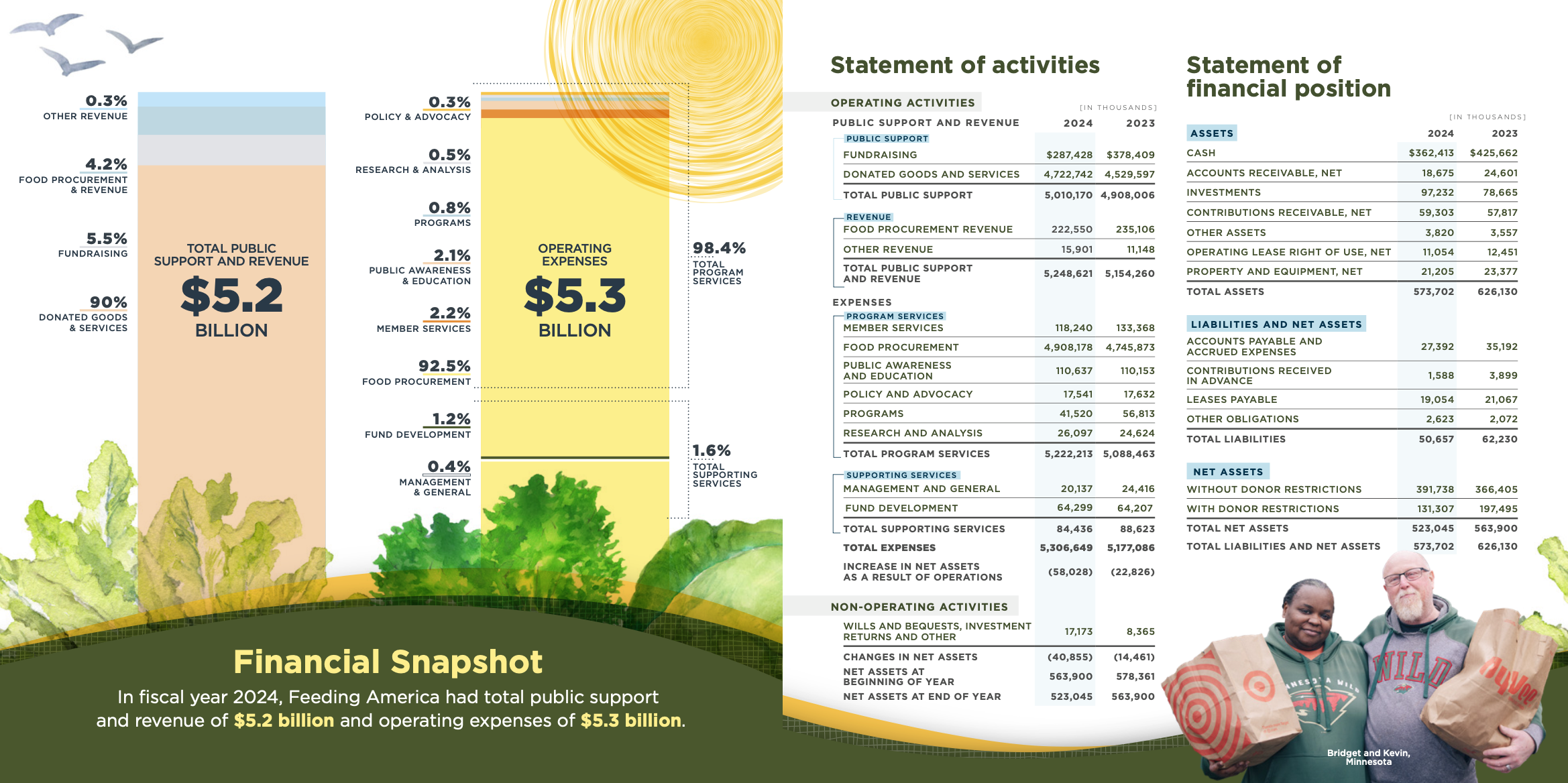
And we love that this report refuses to let accountability look boring. Its earthy palettes, produce-inspired iconography, and data visualizations were designed to feel warm rather than clinical. Even its financial summary (typically the most visually inert section of any annual report) was designed to tie into the organization’s mission with agricultural imagery that provides a visually engaging way for readers to learn about the nonprofit’s revenue and operating expenses.
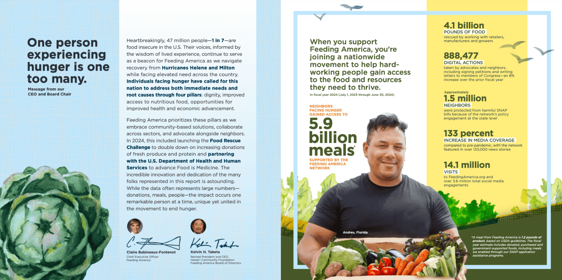
Plus, throughout the report, images of supporters, volunteers, and people served do the emotional work that numbers alone can’t. The effect is a document that feels authentically human.
| Mission-connected data visualization: Smart, mission-aligned design choices turn the least-read section of most reports into something that reflects the organization’s identity. |
| Emotional anchoring through photography: Images of real people woven throughout give the report a warmth and humanity that data alone can’t provide. |
2. Lowe's Foundation
We’ll be transparent: this one’s ours! But we’re especially proud because this report solves for a design challenge many organizations face.
The Lowe’s Foundation’s Gable Grants program represents a $250 million commitment to train 250,000 skilled tradespeople by 2035 — a story that operates at two very different scales simultaneously. At the macro level, it’s about workforce transformation and economic mobility across an entire industry. At the human level, it’s about individual people who found a pathway to a career they might never have considered.
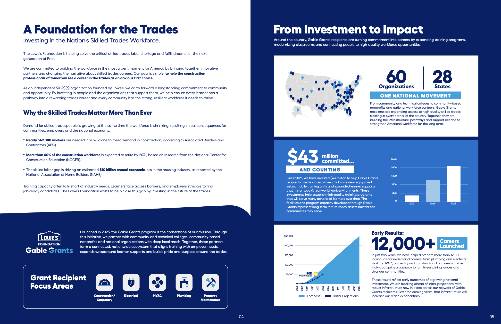
We designed the organization’s 2025 impact report to honor both those scales. High-level impact data and program metrics are presented with the visual weight they deserve, showcasing ahead-of-schedule growth and momentum. And woven throughout are photos and personal narratives that connect those figures to the positive impact they represent for real people.
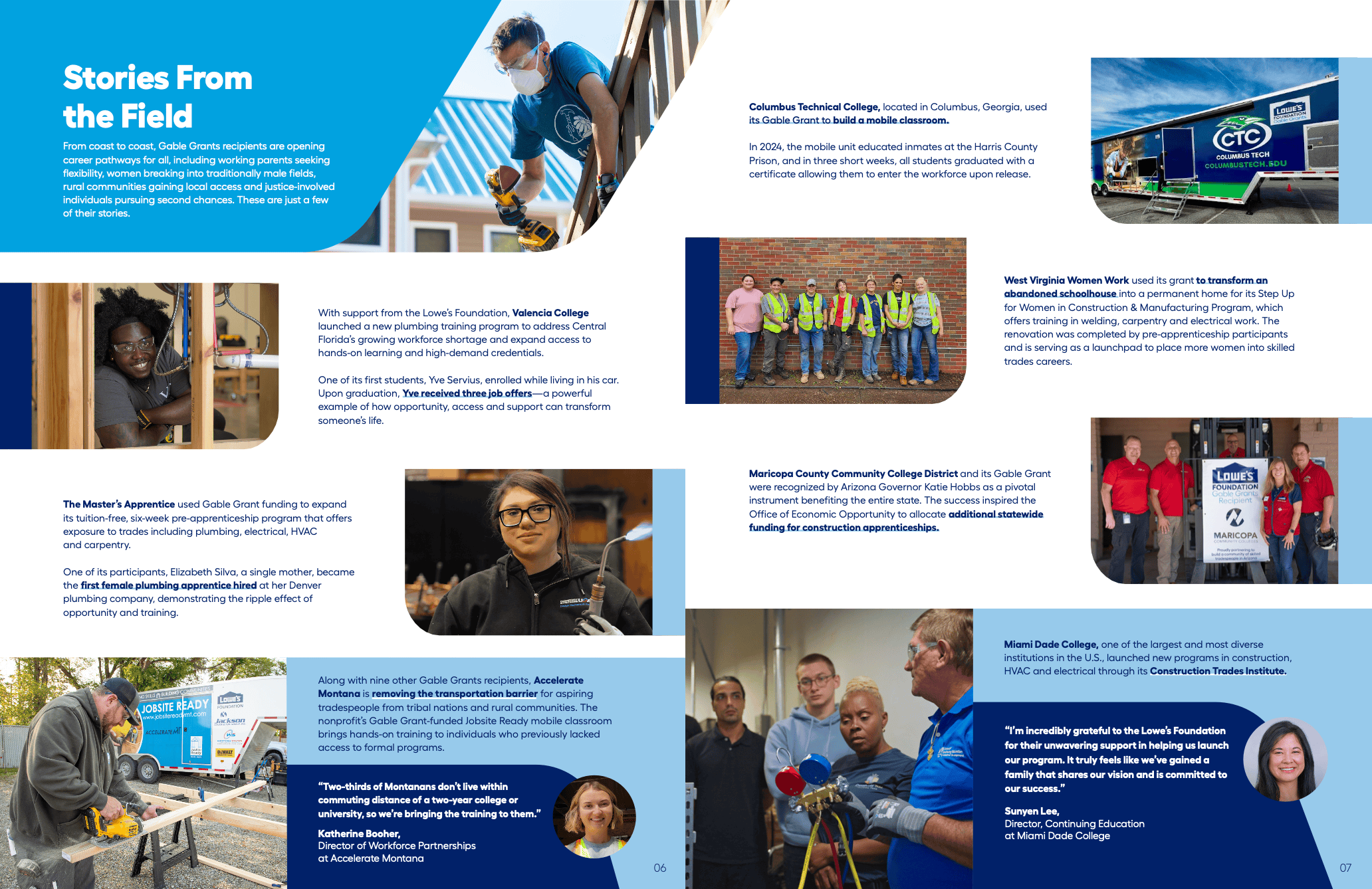
The result is a report that works for a foundation board reviewing program ROI and for a prospective grantee trying to understand whether this program is one that sees people, not just pipelines.
| Dual-scale storytelling: The report moves fluidly between system-level impact and individual human stories, letting each scale give the other more meaning. |
| Growth-forward visuals: Graphic treatments pair with human photography to convey both the ambition of the program and the real people it serves. |
3. Foster Village Charlotte
Foster Village Charlotte’s 2024 impact report earns a place on this list for three distinct design decisions that together make the report feel both professional and genuinely innovative for an organization of its size.
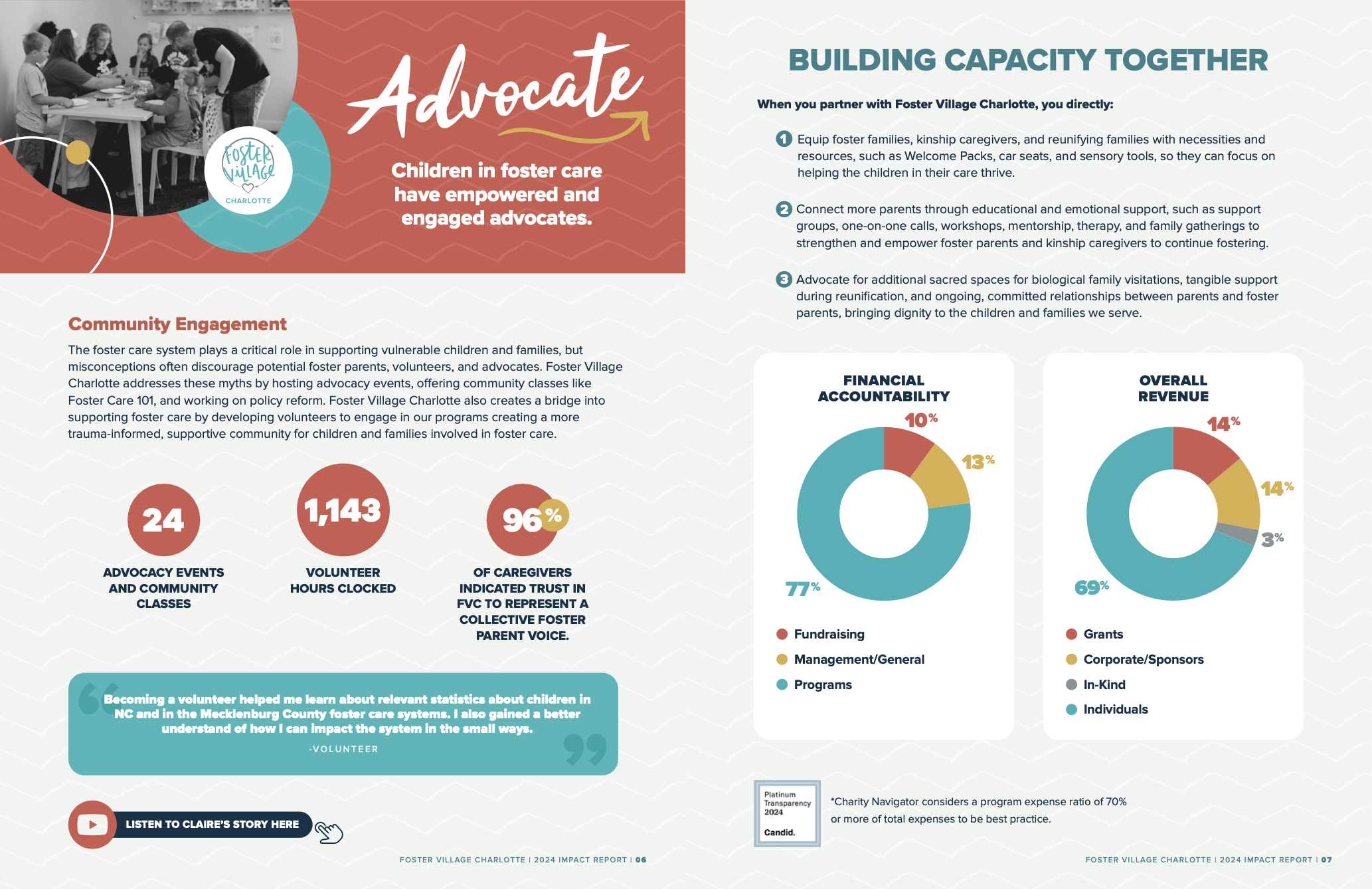
With regard to the nonprofit’s financial accountability metrics, this report does something powerful — it gives readers something to compare them against. Numbers in isolation may invite the question “is that good?” from prospective donors and partners. Providing a benchmark for which to measure against answers that.
The second is the report’s visual identity. Foster Village Charlotte has a clear, consistent brand, and this report lives inside that brand fully and confidently. Color, typography, and graphic elements are all working together.
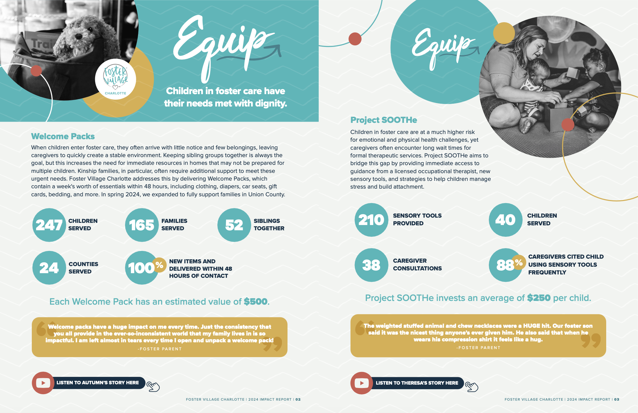
The third is the most technically forward-looking: embedded YouTube links within the PDF. Rather than trying to tell every story in text and static images, the report allows for video-based content, letting the organization’s storytelling range extend beyond what a printed format can hold.
| Contextualized metrics: Key program metrics are paired with a benchmark for comparison, answering a reader’s implicit “Is that good?” query before they have to ask it. |
| Embedded video storytelling: YouTube links within the PDF give the report a dynamic layer and meaningfully extend its storytelling range. |
| Cohesive brand identity: Every visual element reflects a confident, consistent brand that makes the report feel like a whole rather than a collection of parts. |
4. Samaritan’s Purse
Samaritan’s Purse operates across some of the world’s most challenging contexts — disaster relief, medical care, and long-term community development in places most organizations never reach. This means its annual report has to work hard on multiple fronts simultaneously: communicate mission to readers, earn the trust of donors whose resources will reach people they’ll never meet, and demonstrate financial accountability in a way that matches the scale of the work.
We think the organization’s 2020 annual report does all three.
From the opening pages, a reader understands not just what Samaritan’s Purse does, but why it exists and what it believes. That clarity of purpose gives everything else — the programs, the data, the financials — a frame to sit inside.
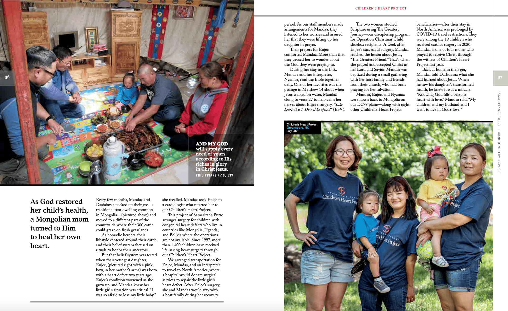
We also love how the photography throughout is authentically people-centered. It showcases not images of communities in crisis, but photographs of individuals in relationship with staff and each other in moments of dignity and recovery. That simple design choice quietly (and powerfully) communicates to readers how the nonprofit sees the people it serves.
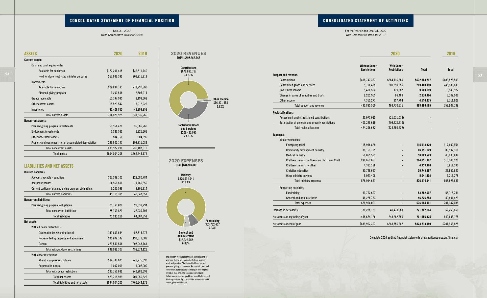
That storytelling is doing the connective tissue work that data alone can’t do. And when the budget and resource reporting does arrive, it’s presented with a transparency that invites scrutiny rather than deflecting it. For an organization asking donors to trust it with significant resources in difficult places, that transparency is no small thing.
| Structural mission clarity: Purpose and belief are built into the report’s architecture from page one, giving readers a frame for everything that follows. |
| People-centered photography: Images depict individuals in relationship and dignity rather than in crisis — a choice that communicates organizational values without a word of copy. |
| Transparent budget and resource reporting: Financial disclosure is presented with enough clarity and detail to invite scrutiny, building trust with donors. |
5. Morehouse School of Medicine
Morehouse School of Medicine’s 2024 annual report format leans fully into the double-page spread, which is a commitment that requires real design discipline and pays dividends in reading experience.
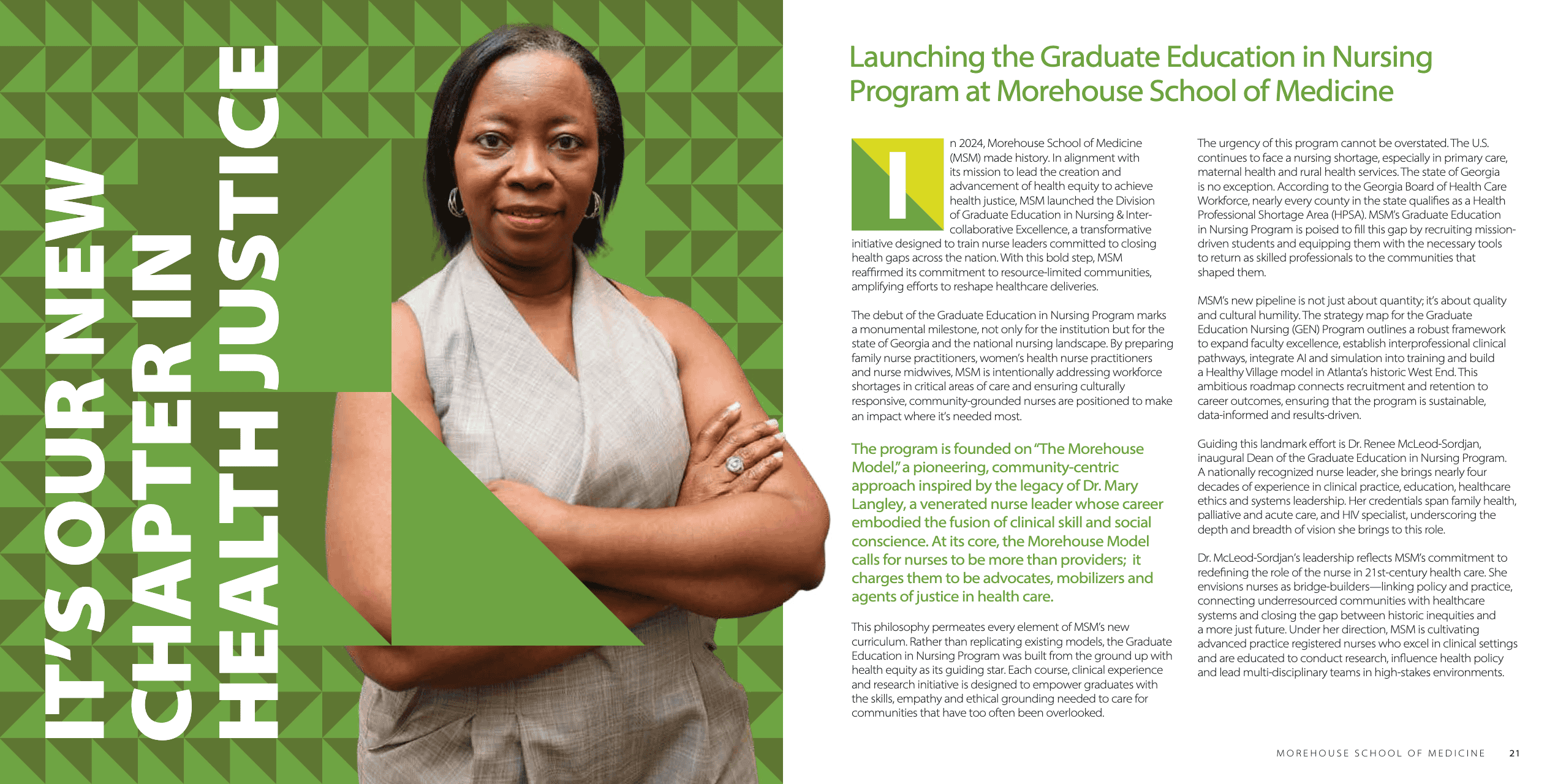
Each spread works as a composition. The eye has somewhere to land, a path to follow, and a natural resting point. The result is a document that reads more like a magazine than a compliance filing — exactly the tone a storied institution trying to attract donors, faculty, and students needs to strike.
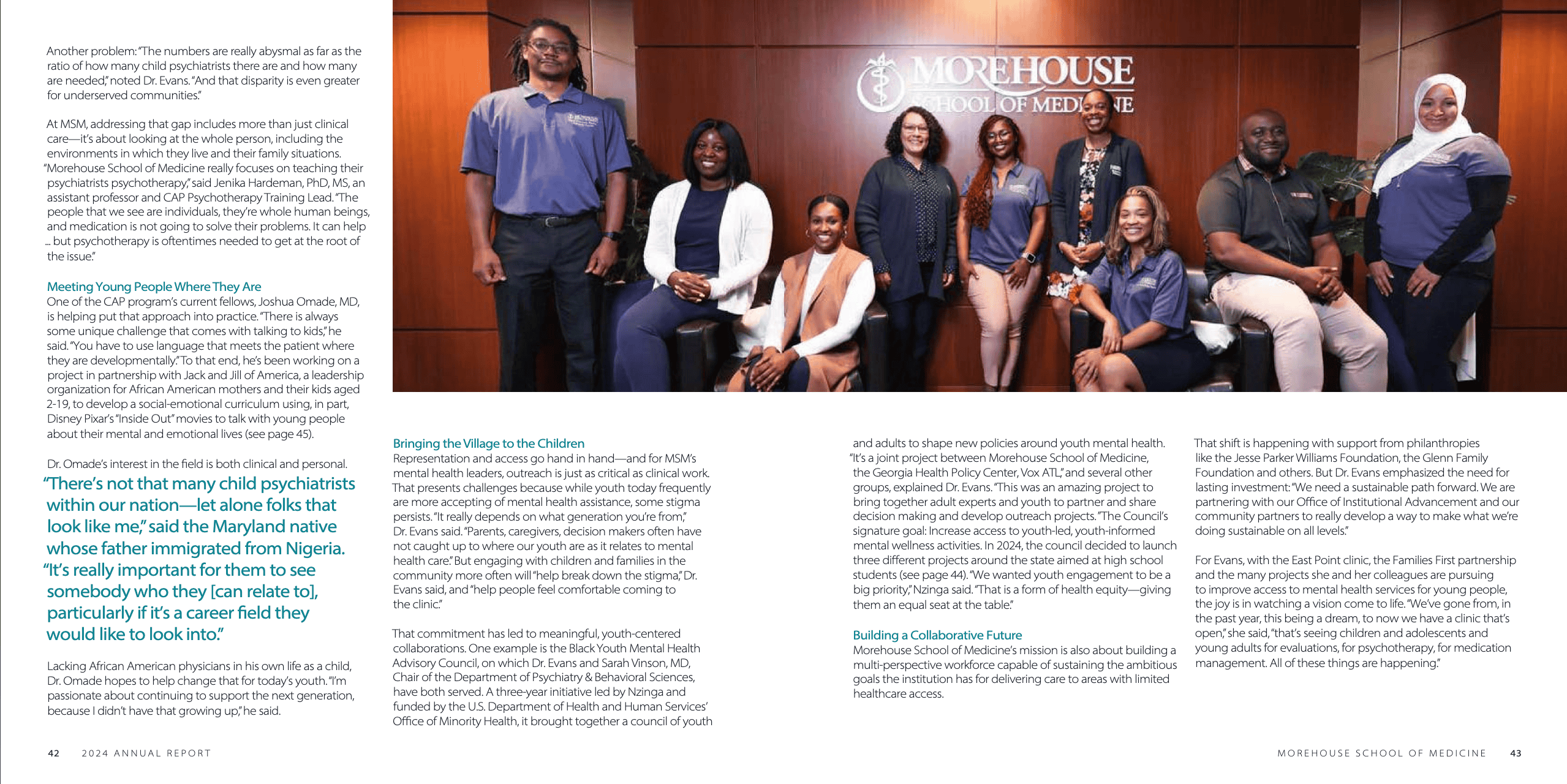
The digital distribution is also worth noting. Rather than opting for simply a printable PDF, the organization chose to host their report digitally on issuu to maximize shareability and make it a true page-turner. That positioning is a design decision as much as a technical one: it signals that this report was made for an audience (not an archive).
| Two-page spread enhances reading experience: Spreads are designed as a cohesive composition, giving the report the visual flow of a well-edited magazine, making it genuinely compelling to read cover to cover. |
| Designed for sharing: The digital distribution approach positions the report as something a reader can easily pass along. |
How to Make Your Annual and Impact Report Do More This Year
The examples above are doing work not just visually, but strategically: the design choices serve the story and the structure earns the reader’s attention (and keeps it).
So, is your report’s design working as hard for your mission as you are? Here are three ways to approach your organization’s report project this year.
1. Find a Report You Love and Let It Guide Your Team. If you have internal capacity, a great starting point is often to identify a report you admire and use it to align your team on tone, format, and visual ambition. A shared reference can be worth more than a ten-page creative brief. Pick one of the examples above, or go find your own! Just make sure everyone looking at it is seeing the same thing.
2. Use a Template and Make It Yours. Having design and writing skills on staff doesn’t always mean there’s bandwidth for a full report build. Annual and impact report production projects are time-consuming and inevitably will compete with your organization’s other creative priorities. Templates built specifically for nonprofit reports can provide a professional foundation that you can adapt to your content and brand. The key is finding one that feels like your mission rather than everyone else’s. If you opt for a template, commit to making it as fully yours as possible rather than just plugging in text.
3. Work with a Design Partner That Truly Speaks Nonprofit. For many organizations, producing a truly impactful year-end report requires a partner who has done it before — someone who understands that, when done well, nonprofit reports are strategic communications tools. At Next Stage, we bring content strategy, writing, graphic design, and production management to help social good organizations produce reports that really resonate.
Ready to produce a report your organization will be proud of for years?
If you’re wondering whether your next report could do more for your organization, we’d love to have a conversation. Schedule a free consultation to figure out which format is right for your goals this year.
📨 Want the latest social good trends, insights, and inspiration delivered straight to your inbox? Subscribe to the Impact Insider today!